Sontheim Industrie Elektronik
MDT 2.0 Modular Diagnostic Toolchain
ODX and OTX standard
The new MDT® 2.0 offers a standardized tool for accessing diagnostic data. The tool offers various options for the creation, structuring and implementation of diagnostic workflows based on the industry standard OTX (Open Test Sequence eXchange format) according to ISO 13209, while the ODX standard (Open Diagnostic Data Exchange) guarantees the reusability of diagnostic services. In addition, MDT® 2.0 supports native RMI support and offers the innovative ODW wizard (Sontheim OTX Diagnostic Wizard), which simplifies OTX editing in a very convenient way without breaking the ISO standard.
Multi platform support
The runtime was developed especially for multiplatform applications and offers multi-platform GUI support as well as a platform-independent description of the runtime workflow language. This reduces both the implementation and testing effort for your diagnostic applications across multiple PC, mobile or embedded platforms. The MDT® 2.0 allows you to create your diagnostic application once and run it on different platforms such as Windows, Linux x86, Linux ARM or QNX without modifications.
Modern design
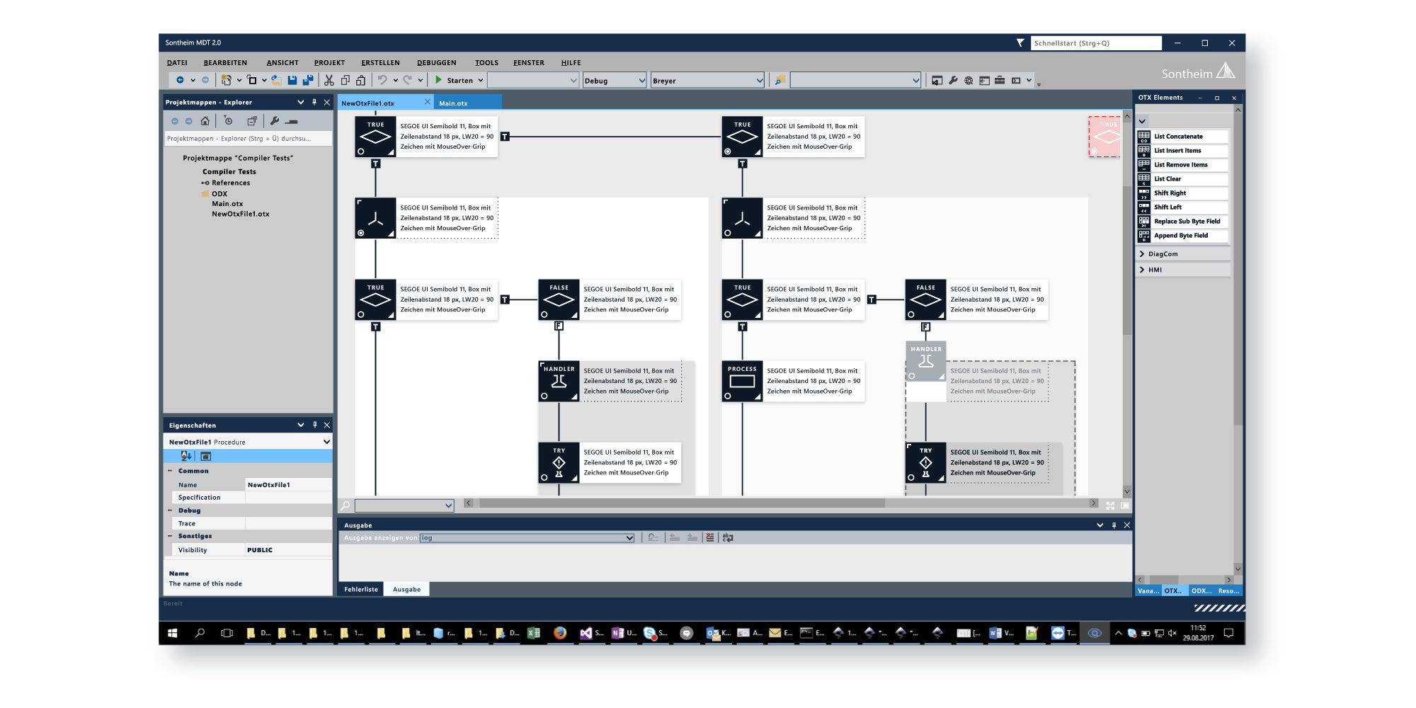
The MDT® 2.0 Authoring Tool is based on Visual Studio to meet the needs of modern developers. A new, clear and modern design allows the use of Visual Studio plug-ins for SVN, Git and other extensions commonly used for development. In addition, new graphical elements such as 2D and 3D animations can be used to create your diagnostic application, making diagnostics more visually appealing and more intuitive for service personnel and diagnostic users.
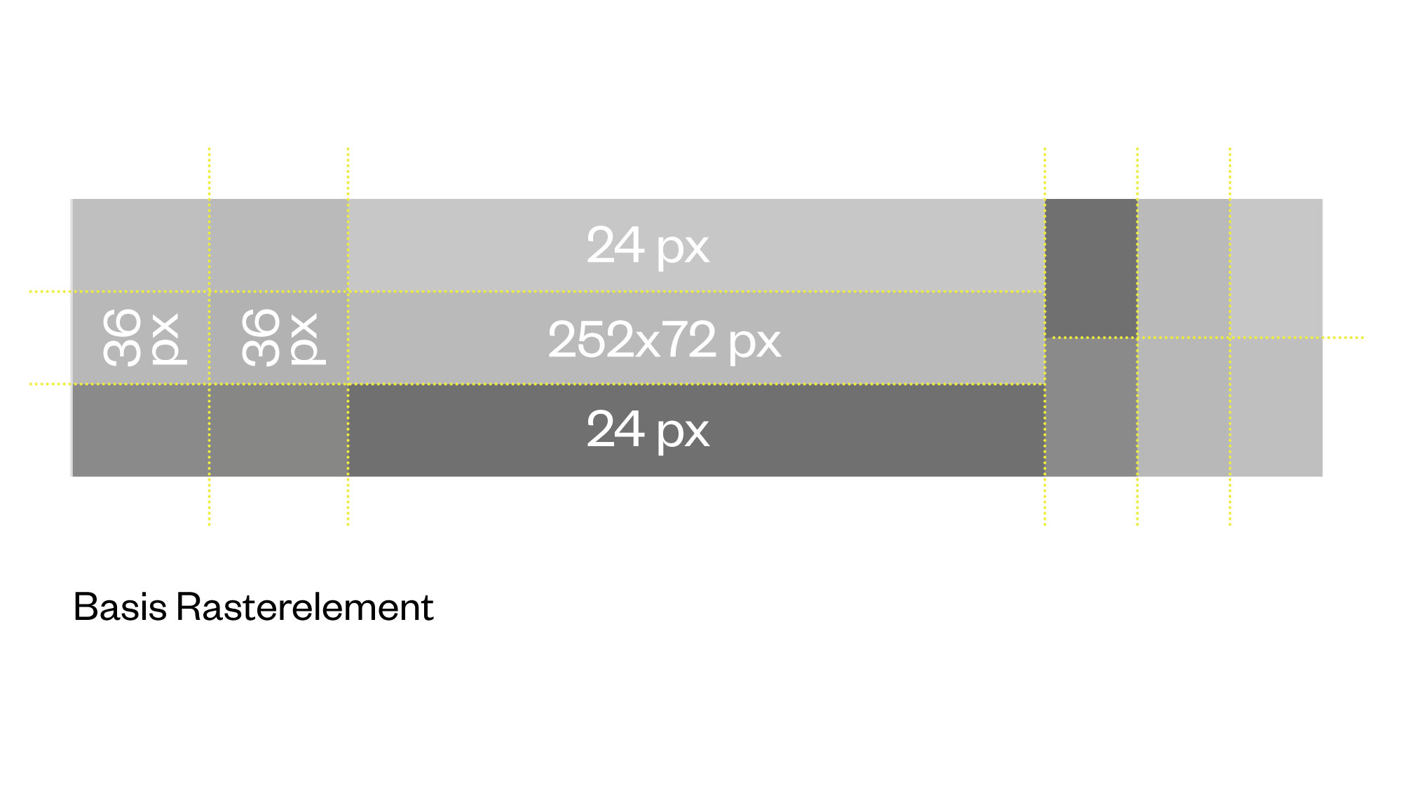
Basic Grid Element
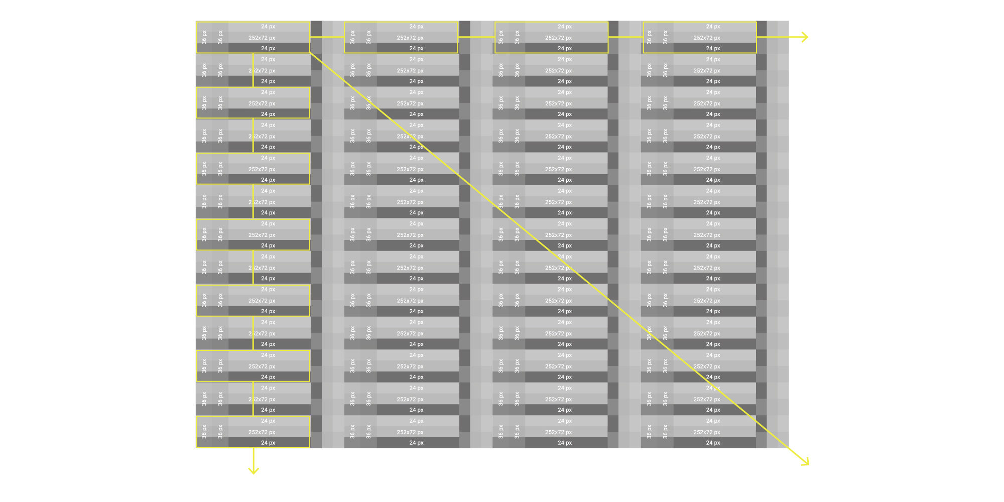
The basis of good usability is a clear layout. The number of elements and their associated positions must be reduced to the minimum necessary so that each positioning is not random but follows a predictable pattern and allows the clearest possible statements about cause and purpose. Grids can be used for this purpose. The designed grid system ensures a harmonious organization of the flowchart and thus a comfortable perception. According to the requirement, at least 4 flow elements can thus be displayed in one line without horizontal scrolling on a working screen on 100% zoom.
Leaps and grid offsets
The basic spacing of flow elements must be a constant value of 72 px (equivalent to the height of a flow element). This allows the entire flowchart structure to retain its order and clarity, both horizontally and vertically, even when there are a large number of flowelements on a screen. The decision to use a grid size divisible by 2 (and more) depends on the decision to always display flowlines with at least 2 px and to be able to center them on the flow elements as well as on the grid lines. Based on this logic, the representation can be generated generically and automatically.
Color matrix und usability
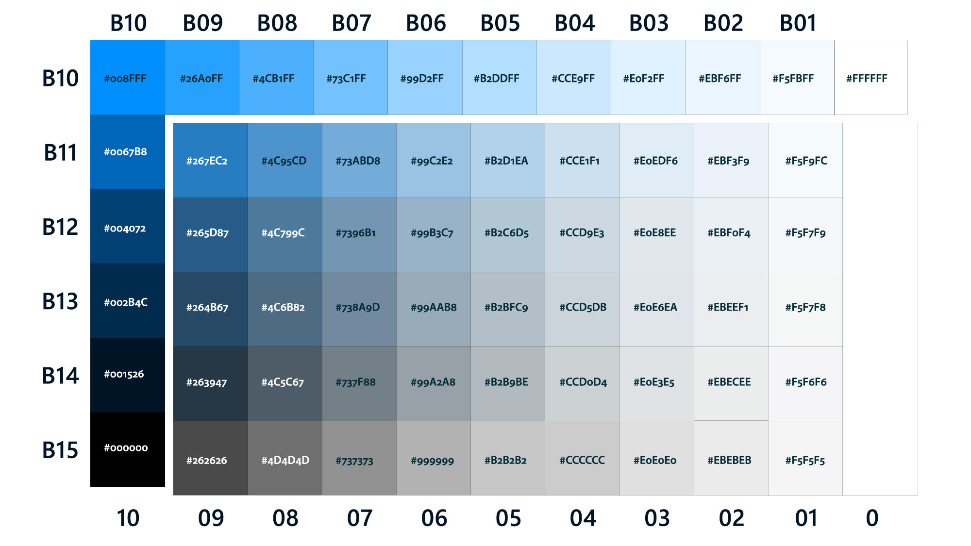
A systematic color matrix was developed for the application with 57 neutral, distinguishable color gradations covering the spectrum from deep blue to gray to white. The color values are organized vertically by luminosity or saturation (chroma B) and horizontally by brightness (01-10). All colors were optimized to show a perceptible difference to their field neighbors. The quality of the perception depends on external factors such as screen quality, ambient light, etc.. The quality of perception depends on external factors such as screen quality, ambient light, etc., so that larger distances have to be used from case to case in order to ensure clear differentiation.
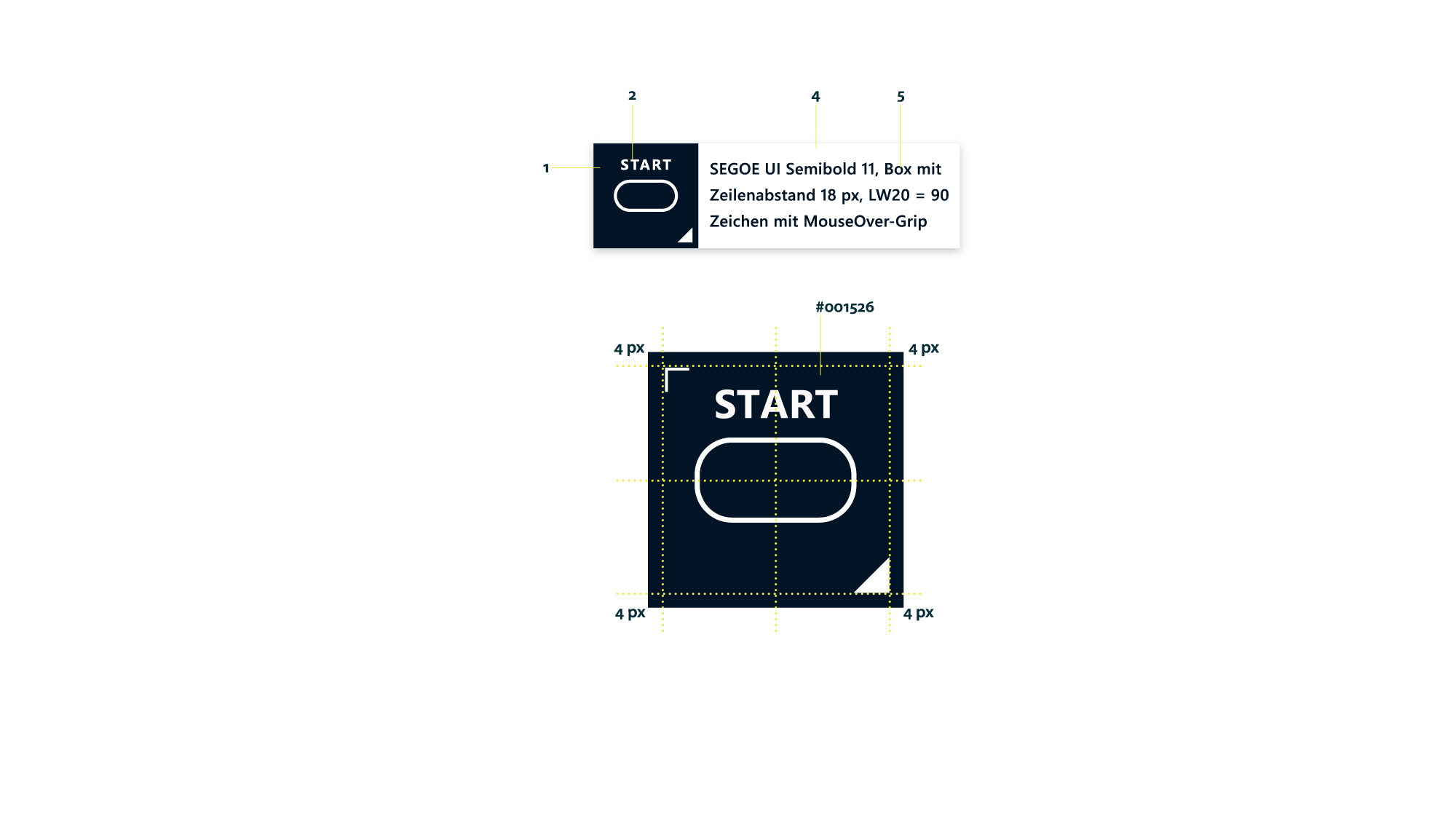
Flow-Elements as OTX building blocks
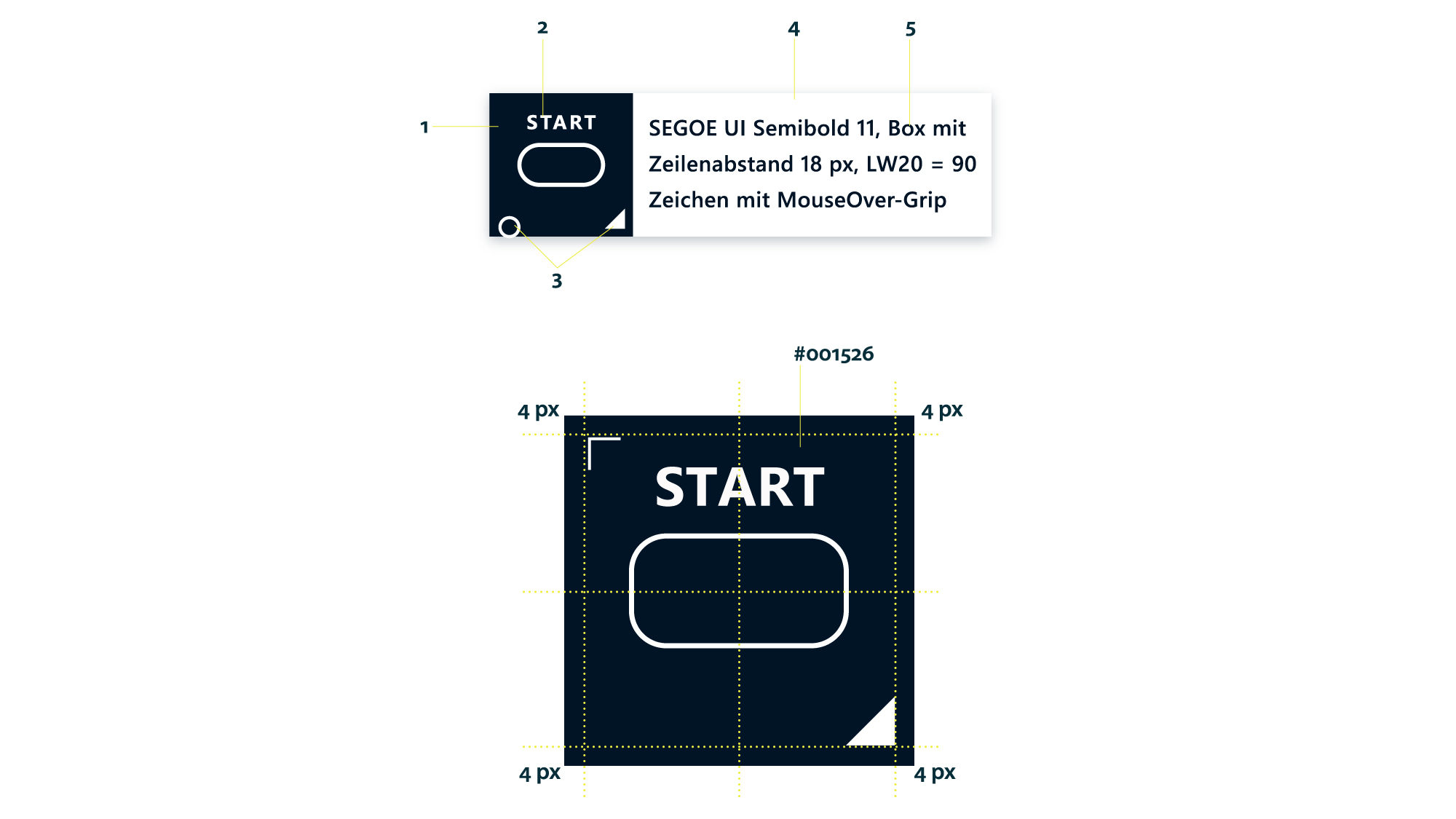
The »flow elements« essentially consist of (1) the combined “IconState container” and (2) an optional »Text container« (left figure). Its outline/fill color is white (State: normal) and must be in high contrast to the fill color of the field. The combination of square and flow icon allows its readability in high quality, even on small zoom levels. Furthermore, it is very important to give the actual flow element a high visual priority and enough free space. This allows the user’s eye to quickly find its way around the screen without being disturbed by the multitude of other elements. In addition, tags such as ‘Breakpoint’ or ‘Note/Comment’ are located in this field. They must be positioned precisely on the grid so that they do not overlap with the flow icons.
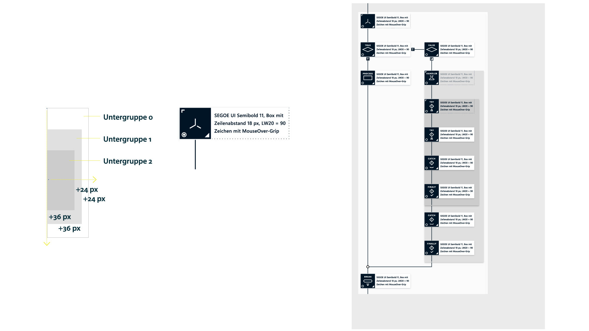
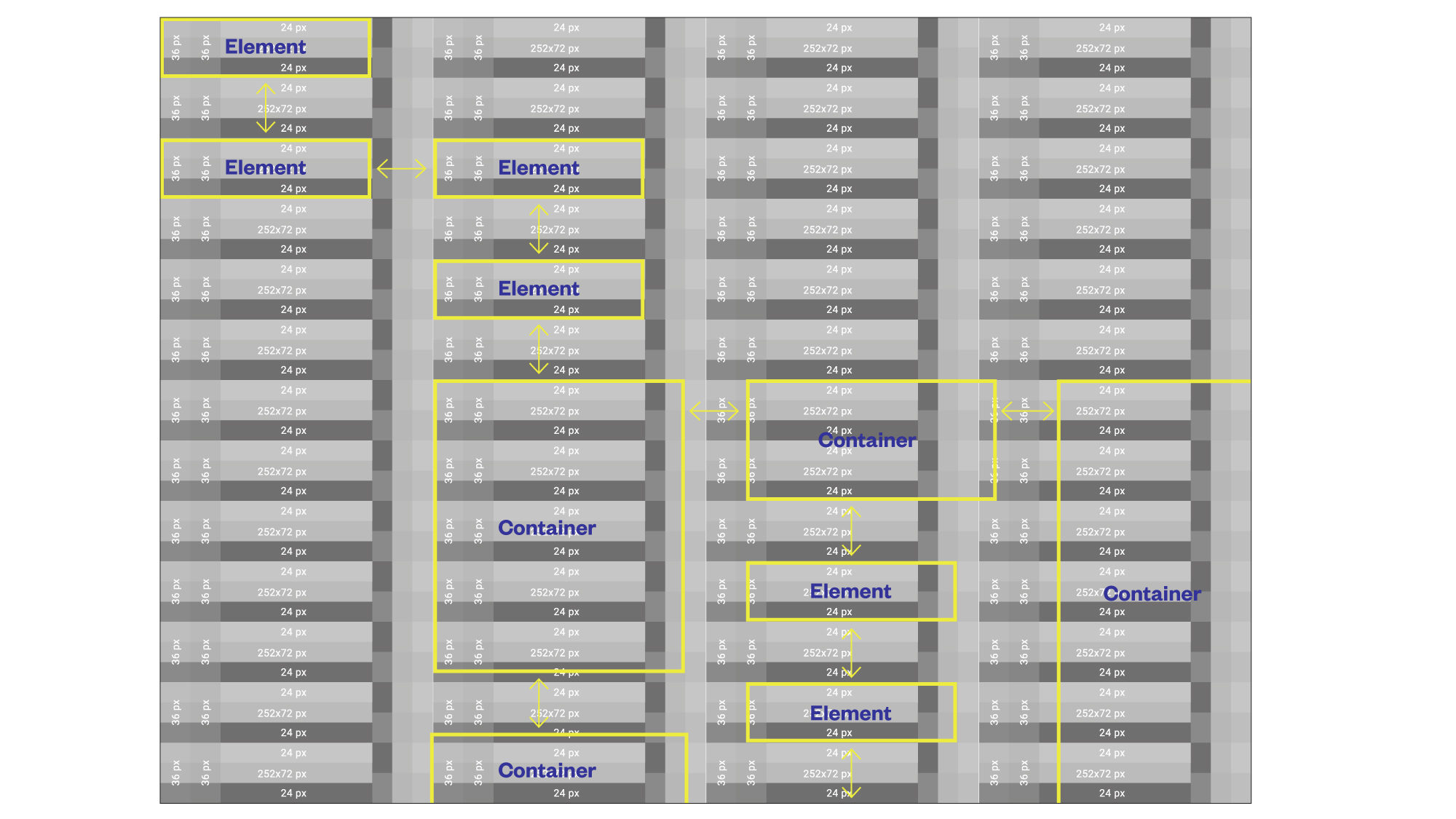
Grouping / Container
In case of a group formation, the white field (2) of the uppermost group element widens in whole steps (24 px each) to the right and downwards (36 px each). At the same time, the text field (5) remains in the same position as before and is indicated only by a 1 px wide dotted line. The subgroup fields are left-aligned, their staggering is to the right. In addition, the light text fields (2) of the main element are fully colored with a gray tone for each subgroup. The gray tone becomes correspondingly darker as the depth of the subgroups increases. The maximum number of gray shades is limited to a maximum of 5, otherwise the group window loses its clarity. If more than 5 subgroups are created, the color coding starts again cyclically from subgroup 6 with the gray value of subgroup 1. The user should generally be advised not to create too many subgroups in order to be able to guarantee a sufficiently visual overview.
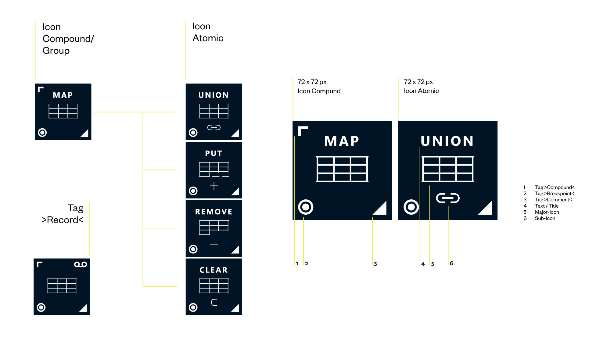
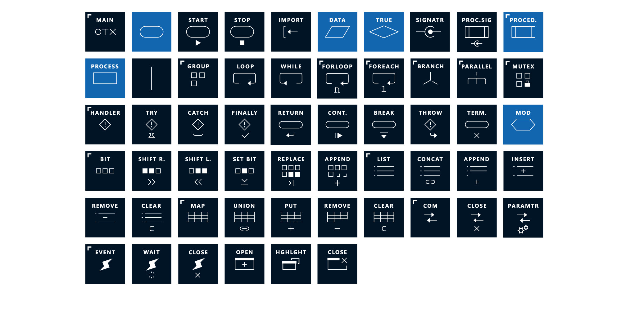
Customized extension of DIN icons
In DIN, only a few flow icons are established (see overview below, light blue). In order to achieve good usability for visual programming, additional logic icons were developed (dark blue), which as an icon system make diverse logic combinations quickly comprehensible. In the basic design of a flow icon, a distinction is made between the main icon (5) and the sub-icon (6). The main icon is always positioned in the center and represents the main action – thus, it always defines the highest priority. In the case of similar functions or within a function group, the main icon remains and can be completed by a varying sub-icon and a different title (see graphic on the left). Visually, this affiliation of main and sub icons is made clear by the vertically centered arrangement, the small distance between them, and the common line width of 2 px. The design of the main icon varies in some cases, for better understanding of the action and to support the sub-icon. The proportions of the element remain the same. Thus, function groups can be represented and the number of main icons can be reduced by grouping them into families.